Inside the Control Room: How We Rebuilt the Dreambook Interface
Why we dropped the dashboard metaphor, what a broadcast gallery taught us about hierarchy, and the performance budget behind every animation.

The problem with dashboards
The first version of Dreambook looked like every other platform: a grid of equal-weight tiles, each competing for attention. It tested badly. When everything is emphasised, nothing is — players scanned the page instead of reading it, and the categories they actually wanted took four seconds to find.
What a broadcast gallery taught us
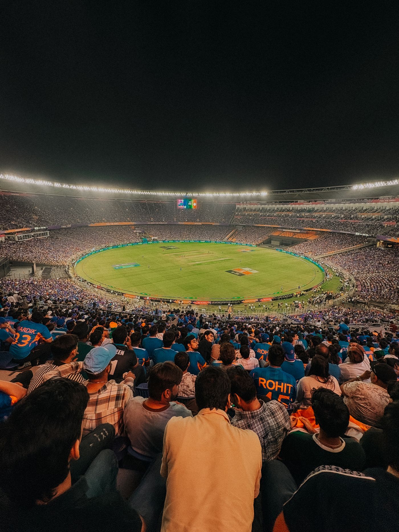
A television gallery solves the same problem every night. Dozens of feeds, one output, and a clear visual language for what is live, what is queued and what is dormant. We borrowed three rules from it: one primary focus per screen, motion reserved for state changes, and a fixed palette where gold means now.
The performance budget
Every animation on the platform has to survive a mid-range Android phone on a hotel connection. That gave us a hard budget: no layout-shifting effects after first paint, transforms and opacity only, and every scroll-driven effect degrades to a static layout when the device asks for reduced motion.
- Largest Contentful Paint under 2.5s on a throttled 4G connection.
- Zero cumulative layout shift once the preloader hands over.
- Every interactive target at least 44px on touch devices.
What changed for players
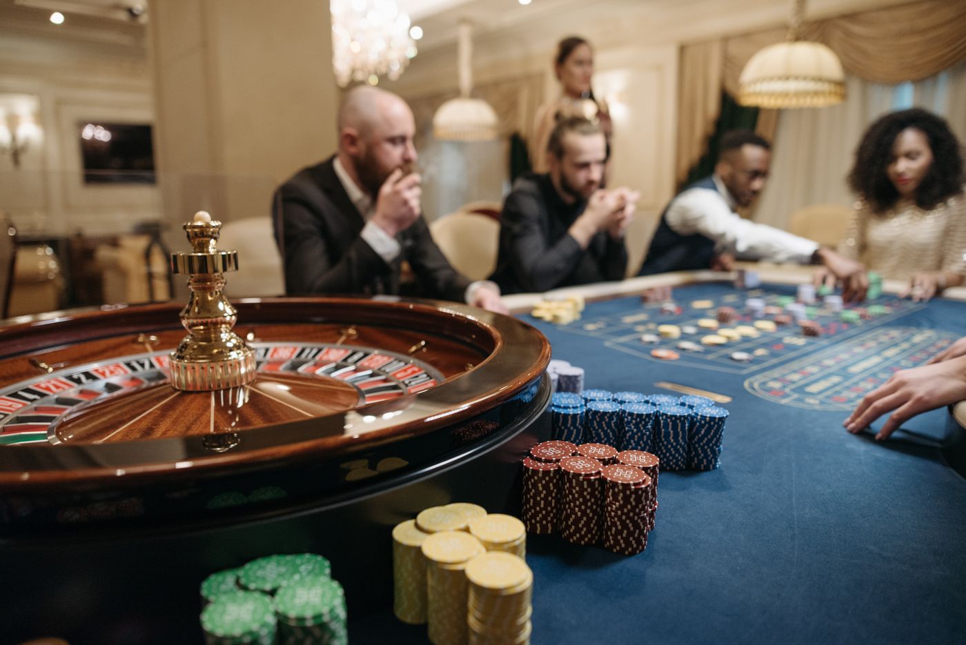
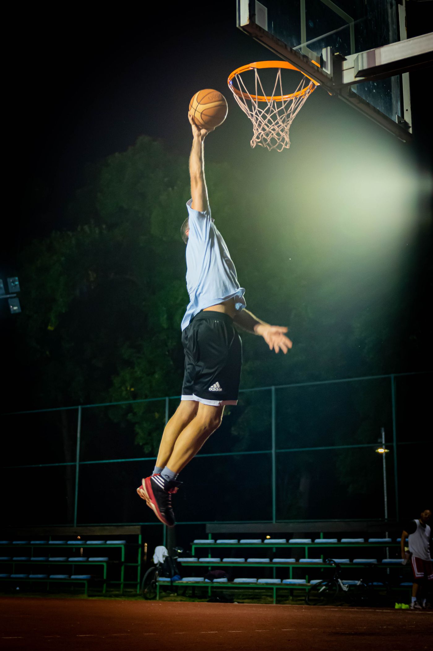
Time-to-first-category dropped from just over four seconds to under two. The categories themselves now carry their own arenas, each with live context rather than a static description. The interface got quieter, and the content got louder.